Design Projects

Type Specimen Booklet
This project was designed to showcase the range and characteristics of the typeface through a modern, minimalist layout. Emphasis was placed on hierarchy, contrast, and clarity, allowing letterforms and characters to remain the focal point. The restrained color palette and clean grid system support both visual impact and readability, highlighting my approach to functional yet expressive typographic design.

Event Ticket
Designed a double-sided printed event ticket following Cal Poly brand guidelines, optimizing layout and hierarchy to fit all required information within a small-format space while maintaining clarity and usability.

Print Collateral
This project has an emphasis on variable data printing and advanced image editing in Photoshop. The goal was to create visually consistent pieces while allowing for data-driven customization across multiple versions. Working with the stablished black-and-white visual identity, I developed layouts that maintained brand recognition while highlighting the exclusivity of limited-edition products.

Student Gift Box
T
his project involved designing a printed gift box intended for student audiences, with a focus on creating a modern, minimalist packaging experience. The goal was to develop a design that felt contemporary and approachable while remaining visually striking in a physical, three-dimensional format. The contrast between the dark gray, vibrant orange, and white lines was intentional, enhancing the unboxing experience while maintaining a refined outer appearance.

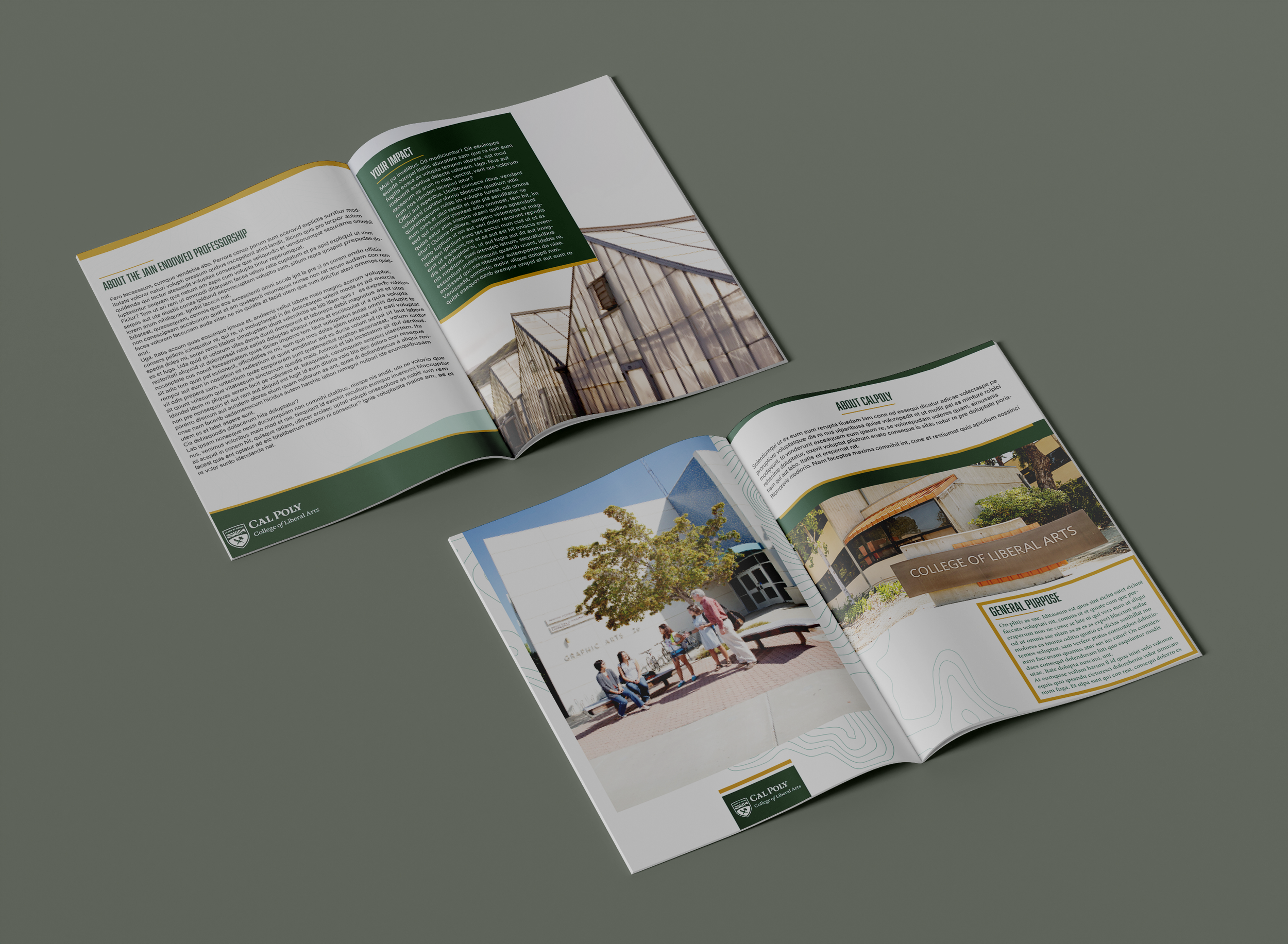
College of Liberal Arts - Magazine Booklet
This project is a digital and print magazine booklet designed to showcase the College of Liberal Arts at Cal Poly, highlighting the department’s programs, opportunities, and resources. I focused on typography, hierarchy, and layout to ensure readability and flow, combining imagery and content to create a cohesive storytelling experience. This project demonstrates my ability to balance creativity with brand compliance, producing a polished publication that is both functional and visually appealing.

Graduate Celebration Card
This project is an advertising card designed to celebrate graduates while promoting a coffee shop’s special graduation promotion. I used a black and gold color palette to convey sophistication, pairing it with refined design assets that emphasize the significance of the occasion. The design balances visual appeal with clear messaging, creating an advertisement that feels both celebratory and upscale.

Cal Poly Marching Band Flyer
The goal for this project was to utilize space effectively for advertising while creating a visually fun and dynamic layout. I incorporated photography, grid-based organization, and playful design elements to create a flyer that is both informative and energetic, reflecting the excitement of the marching band.

Packaging Design - Skincare Product
This project focused on creating packaging for a skincare product tailored to a specific customer segment. The goal was to design a visually appealing and functional package that communicates the product’s purpose while adhering to brand guidelines. I developed a 3D representation of the packaging, emphasizing clarity, aesthetics, and user experience.

Digital Birthday Email Card
This digital birthday card was designed for email distribution to celebrate recipients while following Cal Poly’s established brand guidelines. The design balances playful, celebratory elements with approved assets and layout restrictions, ensuring both visual warmth and brand consistency across digital platforms.

Holiday Card
This project involved designing a holiday card for individuals connected to Cal Poly, with the goal of creating a warm, festive experience while strictly following the university’s design guidelines. Careful attention was given to layout, hierarchy, and tone to ensure the message felt personal, inviting, and appropriate for a broad audience.

Senior Project - Student Loan Equipment Management App
This desktop application was designed to streamline the management of student loan equipment for the Electrical Engineering department. My focus was on creating an intuitive and efficient UX/UI app, ensuring staff could easily track equipment, manage checkouts, and maintain accurate records. This project highlights my ability to analyze user needs, translate them into functional design solutions, and deliver a polished desktop application.

Specimen Poster
This poster project explores the color, character, and personality of two typefaces: Haas Grotesk and Helvetica Grotesk. The goal was to highlight the similarities and differences between the typefaces while experimenting with color combinations and visual hierarchy. I used a futuristic color palette — black and blue backgrounds, red and white for the type characters, and touches of yellow to emphasize contrasts. The design balances bold visual impact with clarity, allowing viewers to compare letterforms and typographic nuances at a glance.

Personal ID Design
This project focused on creating a personal identity through a custom logo that combines my first and last name. The goal was to develop a visual mark that reflects my personal style, professionalism, and design sensibility. I explored typography, composition, and simplicity to create a logo that is versatile and memorable.

Birthday Card - Variable Data Piece
This project is a print and marketing collateral birthday card for Crunchyroll, designed to engage customers through personalized messaging using variable data printing. The card dynamically adapts images and text based on each customer’s subscription level, creating a customized experience that also promotes Crunchyroll’s services. I incorporated brand colors, anime imagery, and playful design elements to maintain consistency with Crunchyroll’s identity while enhancing visual appeal.

Typeface Specimen 2
This project is a typography specimen exploring type through a modern and mysterious design approach. Using a black-and-white palette, I combined geometric shapes and playful layouts to create visual intrigue while emphasizing the character of the typeface.

Cooking Booklet
This project involved designing a printed, saddle-stitched cooking booklet with a focus on typographic hierarchy and editorial layout. The main goal was to explore how type can guide readers through content while creating a cohesive and engaging visual experience.

New Year Calendar
This one-page New Year calendar was designed for digital distribution to connect recipients with Cal Poly while following strict brand guidelines. The challenge was balancing festive seasonal design with essential dates and information within a single-page layout, requiring strong hierarchy, spacing, and prioritization.